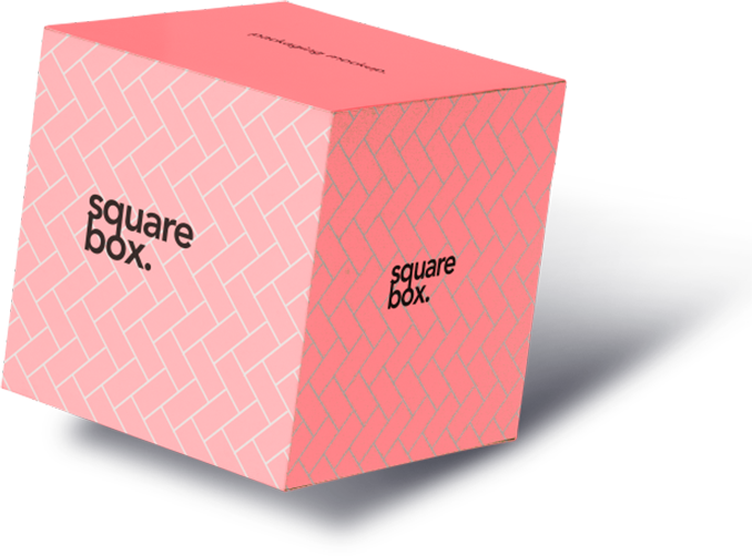
Taking Advantage of Colour Psychology With Product Boxes Wholesale
by
Posted: February 17, 2021
by
Make your custom printed boxes incredible with us!
For custom projects of large quantity of Custom Boxes or Custom Printed Boxes, Dodo Packaging is offering die cuts, litho, special finishes, additional styles and more.
Get a Free Quote